
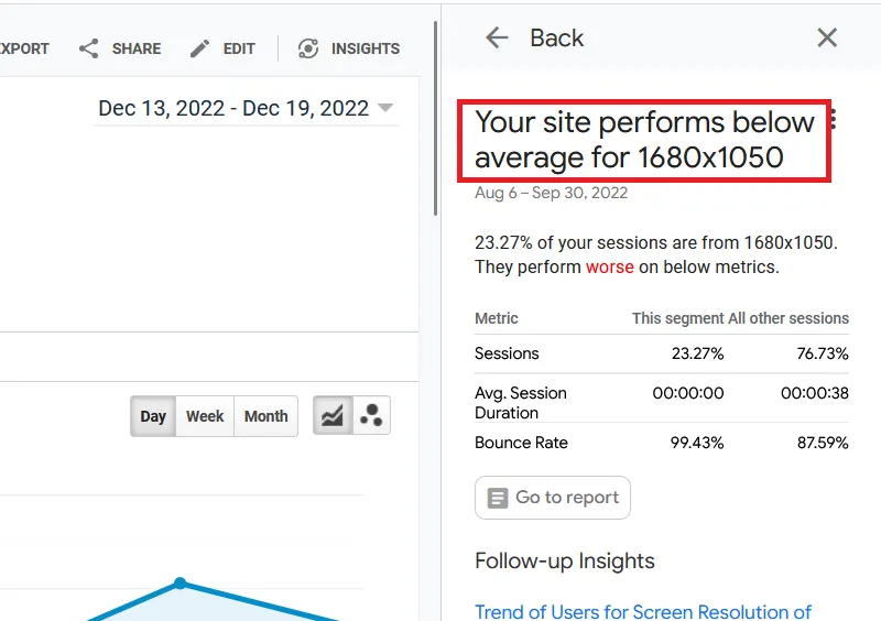
If you develop your website on a small screen, you must test it on higher screen resolutions. A few days back, I got this message on my Google Analytics insights tab:
“Your site performs below average for 1680×1050”
Here’s a screenshot:
Naturally, I was worried that my site was displaying improperly on higher resolutions, so I did a bit of testing. Unfortunately, I used Firefox as my first testing device, and I spent a lot of time trying to fix a problem that didn’t exist. So don’t make the same mistakes I did.
Test Higher Screen Resolutions on Google Chrome
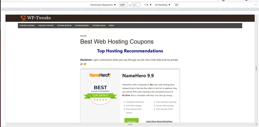
Open your website on Google Chrome and activate the developer tools. You can do this by hitting F12 or pressing Ctrl + Shift + C. This will bring up a developer pan, but it’ll also allow you to enter a screen resolution on the top manually. Enter a higher resolution, and it’ll show you what your site looks like. For example, here’s a screenshot of me testing WP-Tweaks.com on Google Chrome at a resolution of 2000 x 1050:

As you can see, my site displays just fine on 2000 x 1050.
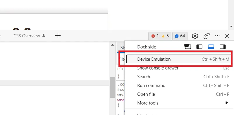
Testing Higher Screen Resolutions on Edge
Testing your site on different screen resolutions requires one more step on Edge than Google Chrome. You have to open developer tools in the same way, but you have to click on the three dots in the top right-hand corner and select “Device Emulation” as shown here:
You can also open device emulation on Edge using the Ctrl + Shift + M shortcut. From here, the interface is just like Chrome; you can type in your device’s resolution to see what your site looks like. Here’s a screenshot:
Edge, like Chrome, shows that my site displays fine on higher screen resolutions.
Why you SHOULDN’T Use Firefox for Testing Higher Resolutions
The problem comes when you test higher screen resolutions using Firefox. The emulation tab is easy to bring up – click Ctrl + Shift + M, but when you type in a screen resolution that extends beyond the limits of your physical screen, Firefox doesn’t zoom out the way Chrome or Edge does. Instead, it pushes the content to the right-hand side and makes it look as if your site is displaying incorrectly. Here’s a screenshot:
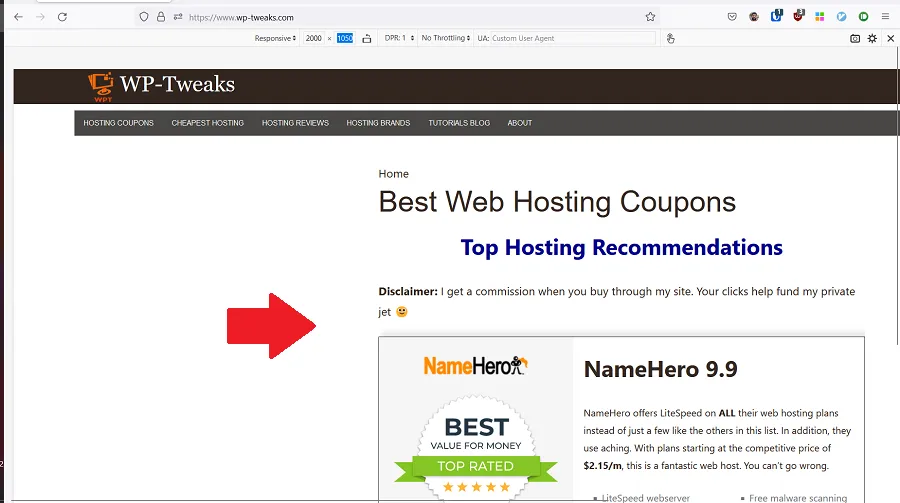
As you can see, it appears as if my site is misconfigured on a resolution that’s too wide for my current screen. As a result, I spent a lot of time debugging and trying to fix a problem that didn’t exist! Only when I checked it on Chrome and Edge and on my wife’s computer, which has a dedicated monitor, did I realize there was nothing wrong with my site.
So the moral of the story is – Chrome and Edge are excellent browsers for testing higher screen resolutions. But don’t use Firefox since it doesn’t display them accurately.
Speak Your Mind