
Even responsive design isn’t enough for some tables. You can shrink the number of columns, and try all kinds of tricks to show them on mobile devices, but sometimes you just need to show a different table entirely. Perhaps one with a little more streamlined data that’s specifically been optimized for smaller screens. In this tutorial, I’ll show you how to do just that.
Proof of Concept: Why Responsive Design Isn’t Enough
I first encountered this problem on this very website. I buy and sell web hosting here – and one of the web hosts is Hostgator. I have this huge table of Hostgator coupon codes which doesn’t show up well on mobile devices. Especially the last column titled “Description”.
On the desktop, the “Description” column contains quite a bit of data. Here’s what it looks like:
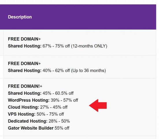
However, when I view this same table on mobile devices, it looks terrible. I know what you’re thinking – “Responsive design! Just stack the columns on top of each other with the first column as a header”. It’s a neat trick, but insufficient for one big reason.
Poor Featured Snippets
Ever since Google started “mobile-first indexing”, I’ve had a problem with how it grabs table data for featured snippets. With responsive design, the Googlebot grabs the mobile-version table and shows it as a featured snippet, which frankly, looks horrible.
The only solution is to have a mobile-based table that looks pretty much the same as the desktop version, but with more streamlined data. And with my solution, here’s what the mobile version of the Hostgator coupon code table looks like:
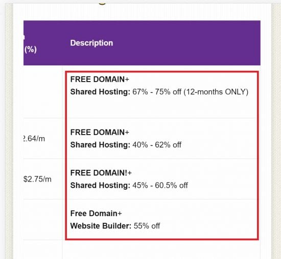
In the above screenshot, you can see that the mobile version of the table is stripped down and shows less data than the desktop one. This is fine with me. Now when the mobile Googlebot indexes my site, it’ll pick up this version and show it as a snippet, which looks much better than a responsive design.
So here’s how to show a different table for smaller screens.
1. Create your Two Table Versions
The first step is to create your two tables – one for the desktop, and one for smaller screens. Place them both in your post one on top of the other. It doesn’t matter what the order is.
In WordPress, you can use either custom HTML blocks for your tables, or even generate them with shortcodes. It doesn’t matter.
2. Assign a “Mobile” and “Desktop” Class to Each Table
Now, using custom HTML blocks, enclose each element in a separate “div” element, and give them unique class names. For example in the screenshot below, I’ve chosen to call them “mobile-only” and “desktop-only”.
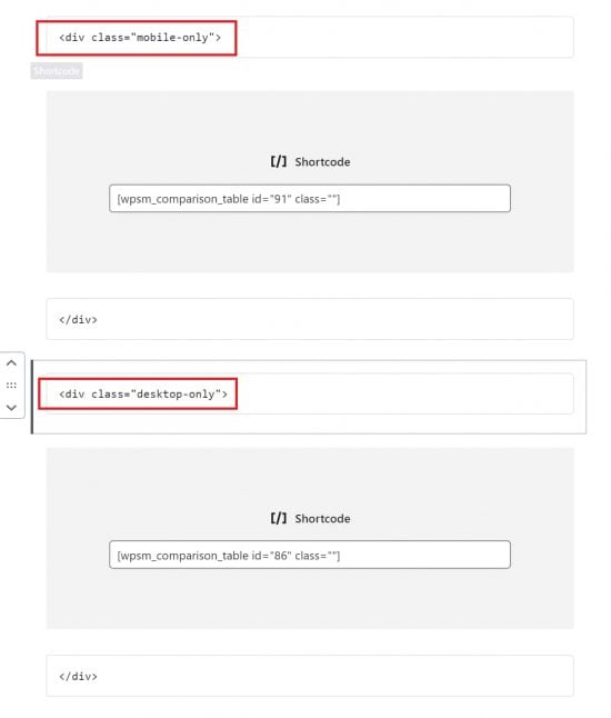
The Gutenberg custom HTML blocks in WordPress make this very easy. Just enclose each table element with two HTML blocks as shown above.
3. Add the CSS to Show a Different Table for Mobile
At the very top, add a new HTML block to hide and display each table based on the screensize using media queries. For example, to hide/display my Hostgator coupon table, I used the following CSS:
<style media="all">
.mobile-only{display:none}
.desktop-only{display:table}
@media (max-width:800px){
.desktop-only{display:none}
.mobile-only{display:block}
}
</style>
The “max-width:800px” setting specifies that I want the mobile table to be displayed only when the display width is below 800 px. In that case, hide the desktop version and display the mobile one.
And you’re done! Save your changes and preview your post under different screen sizes and you’ll see that it works.
Bottom Line
In many cases, responsive design is sufficient to show the same element on different screen sizes. But often, we need to show something completely different one mobile devices, and this little trick will help you do it!
Speak Your Mind